Critida Extra Virgin Olive Oil Promoting Accessibility in Packaging
Promoting Accessibility in Packaging: The Innovative Olive Oil Label by Critida
We at Leftgraphic are proud to present our latest project, the olive oil label for Critida, which represents a true innovation in design and packaging accessibility.
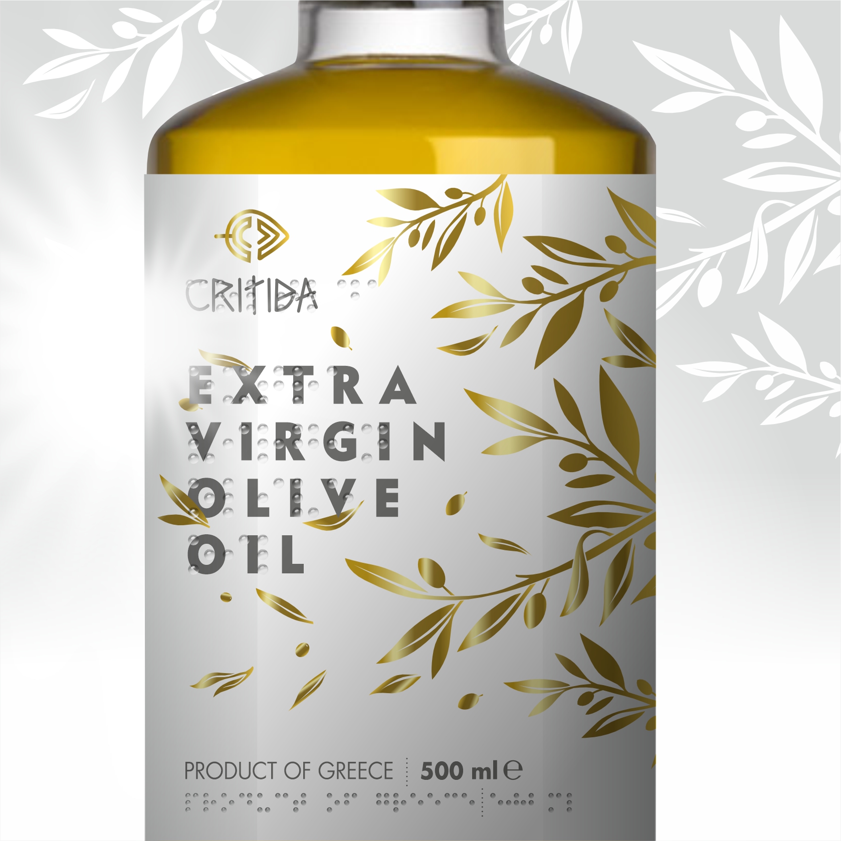
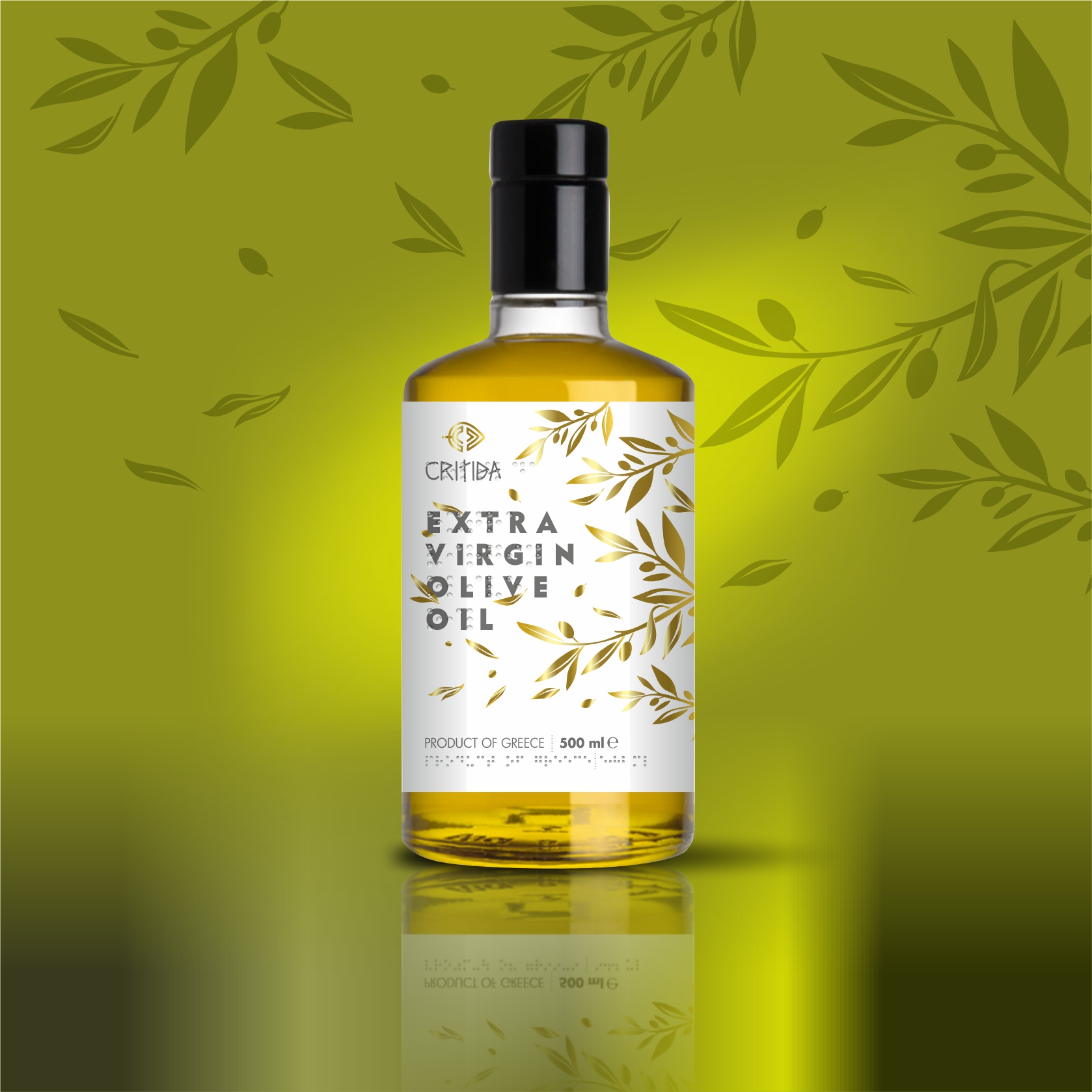
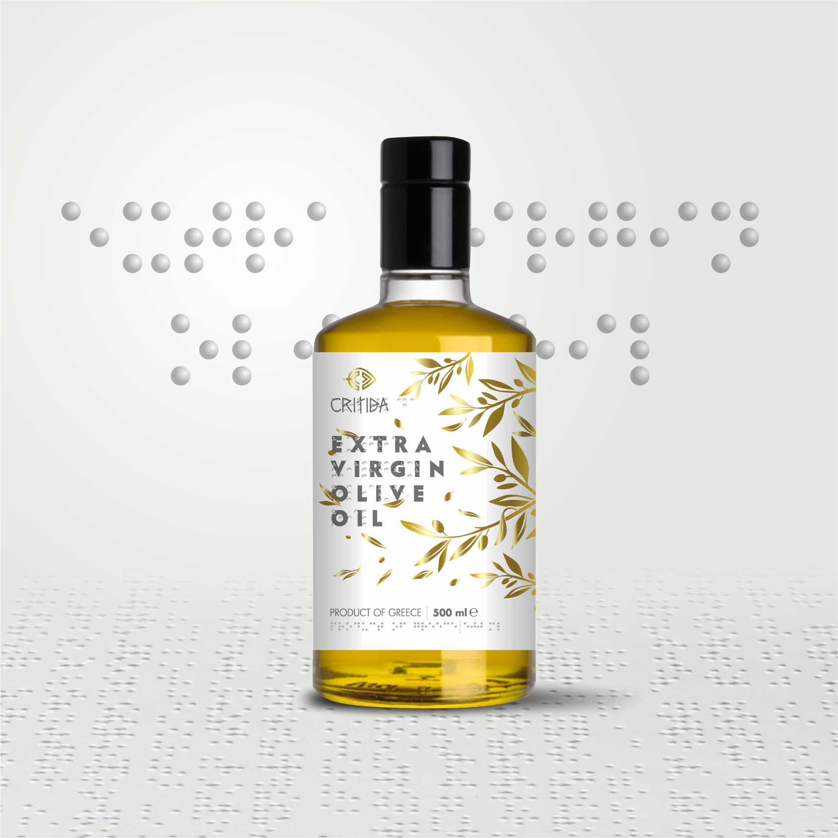
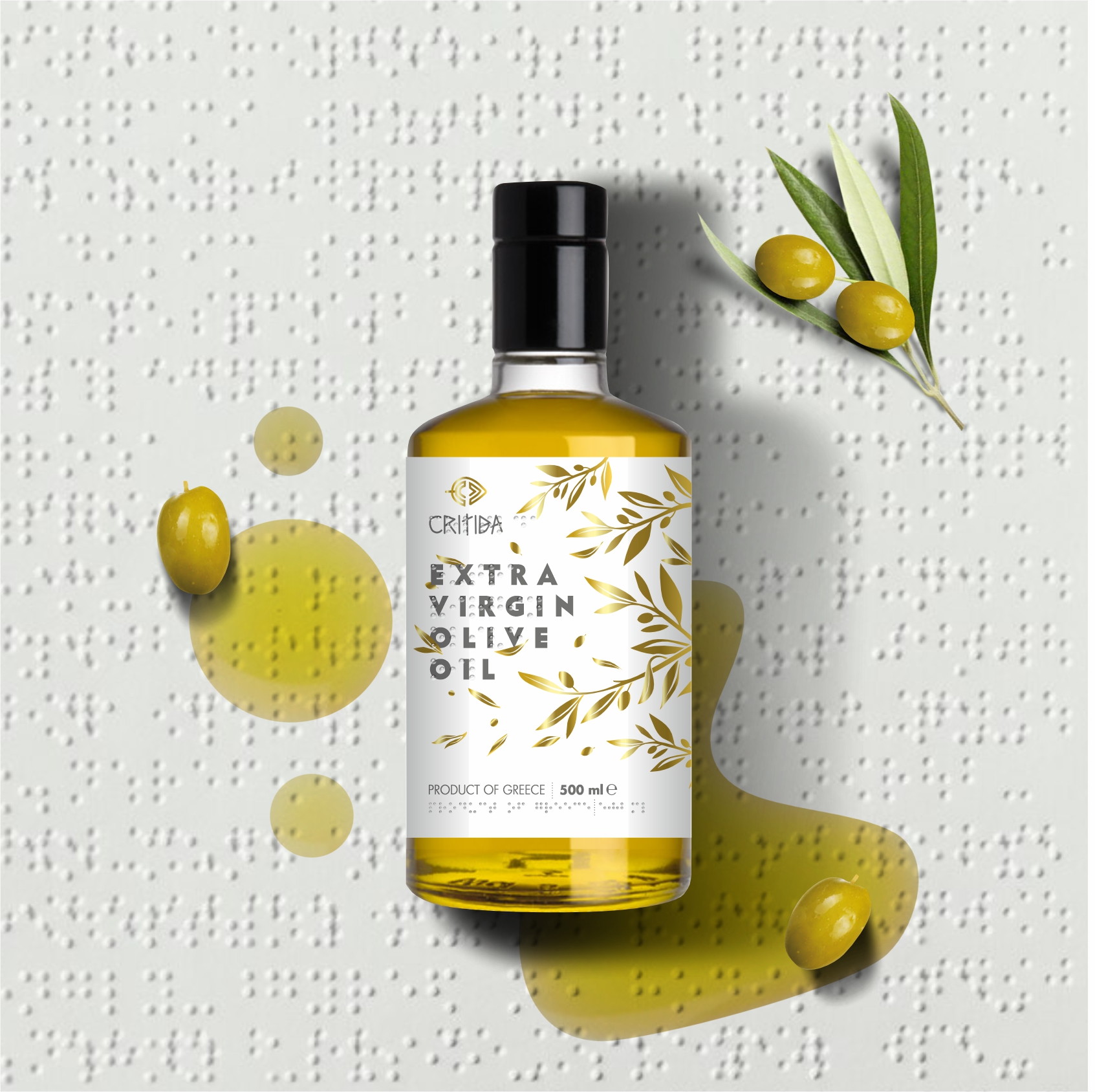
The label was designed with a modern aesthetic, featuring olive leaves in gold against a white background. The color choice and design reflect the purity and quality of the olive oil, imparting a sense of luxury and refined style.
What makes this label truly exceptional is Critida’s initiative to incorporate Braille, making it one of the first olive oil labels to offer accessibility to visually impaired individuals. In this way, we enable everyone to read product information, promoting equality and independence.
We are extremely proud of this initiative and our pioneering approach to design. We firmly believe that accessibility should be a fundamental element of design, and we are delighted to actively contribute in this direction.

