Organic Cretan Extra Virgin Olive Oil ELASION
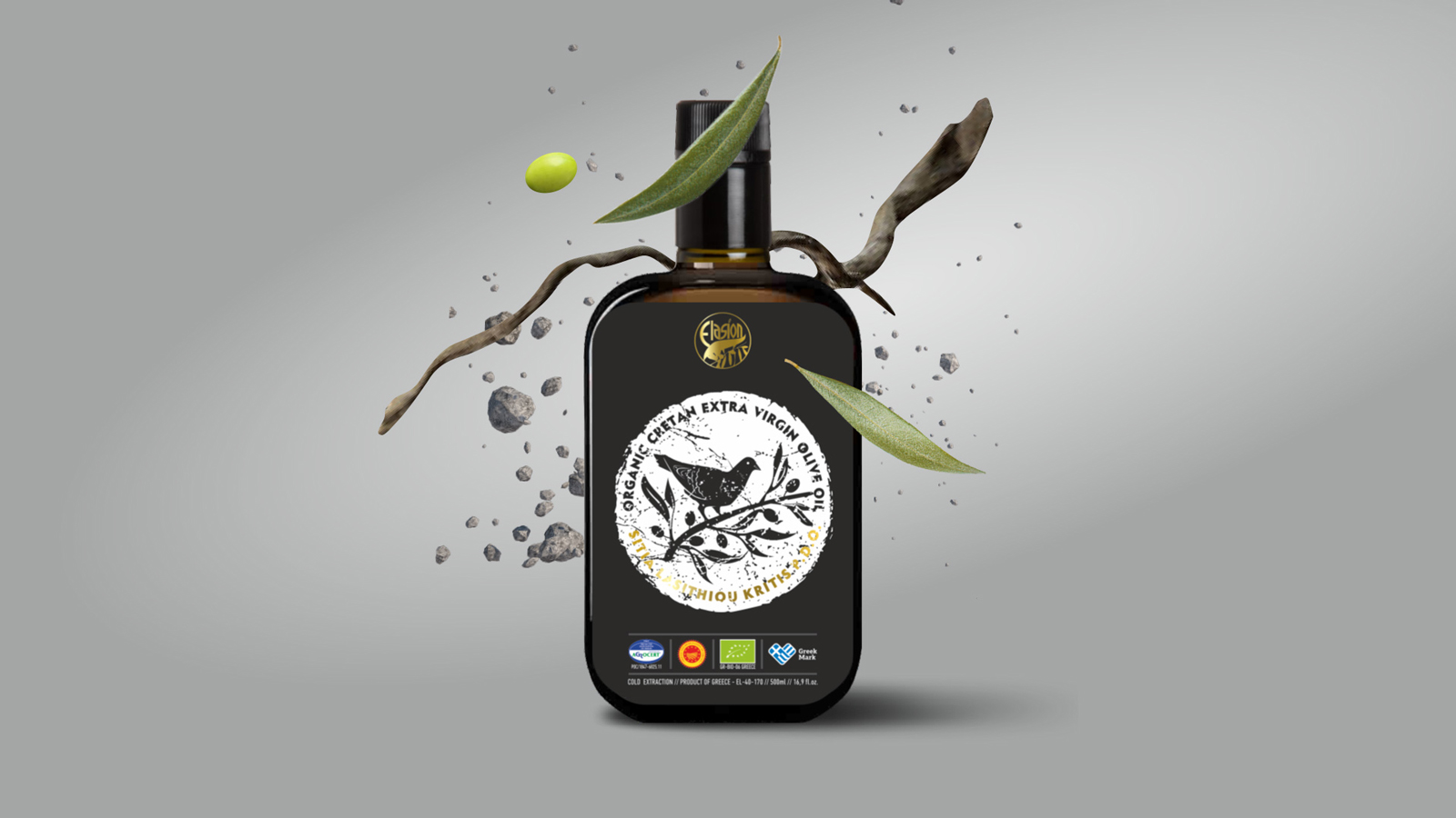
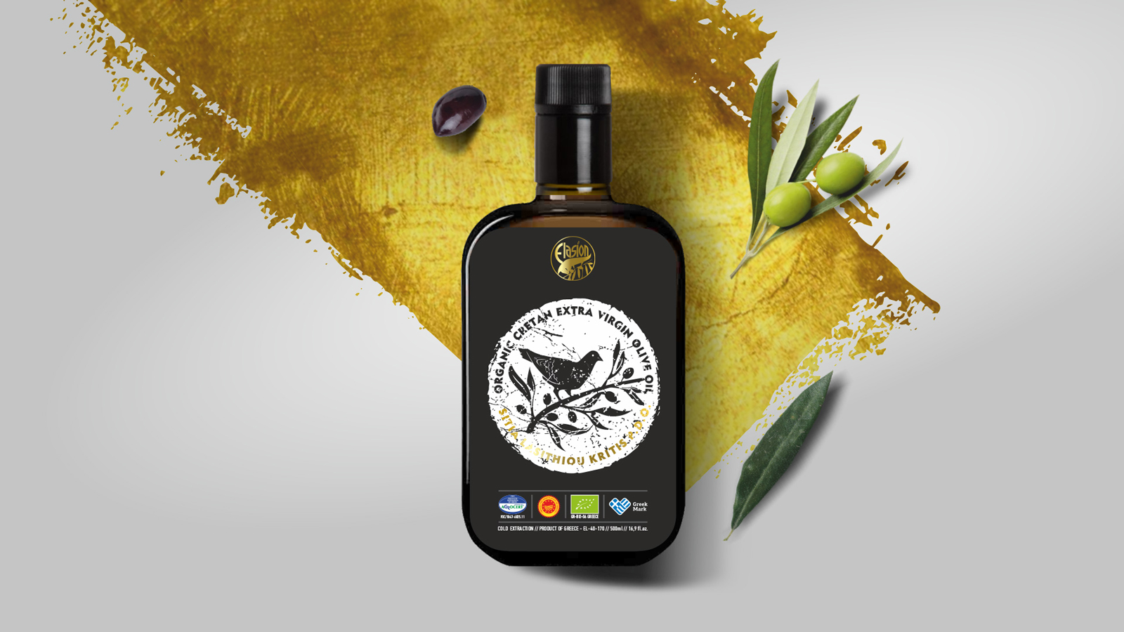
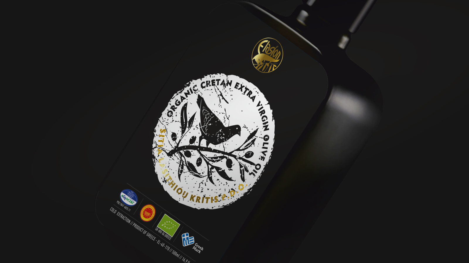
A new product label for Organic Cretan Extra Virgin Olive Oil P.D.O. of Elasion company was one of the recent design projects for our team.
The company we had the chance to work with, is an olive oil company located in Kalamafka Ierapetra. A beautiful place in southern Crete. Since 1975, the family business Elasion has been devoting itself to the passion of olive oil production. Since 2010 the company is active in the field of standardization, and the products become internationally recognizable, bearing distinctions and all the necessary certifications.
The aim was to design a label with great strength so that the product would consolidate a position in the olive oil market, highlighting the good quality of the product.
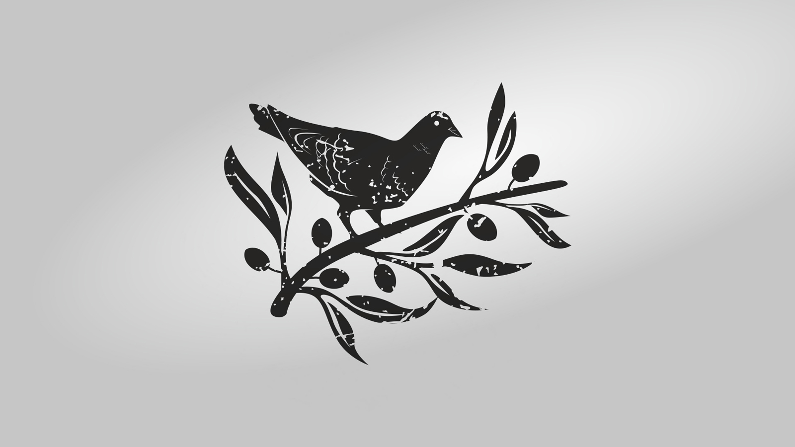
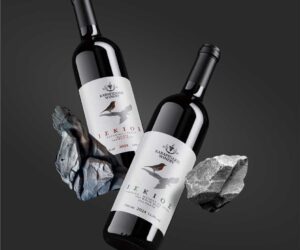
Olive oil is a wonderful gift of life. This was the inspiration and was depicted by the white dove, holding an olive branch in its beak. It is also considered a symbol of peace and hope around the world. The simplicity of the illustration creates an eye-catching, attractive, and traditional form on the product label. It was the most appropriate way to point that Organic Cretan Extra Virgin Olive Oil P.D.O.is a high-quality product of organic farming.
The leading colors of the illustration are black and white. With this strong and clean color combination, we wanted to approach the purity of olive oil and the elegance of the product itself, and its beneficial properties for health. Also, the use of black glass bottle conducts a high aesthetic product in the market of olive oil.
Elasion ORGANIC SITIA P.D.O. has been granted the Special Mention Award
in the category of Packaging for Excellent Product Design by the German Design Council.

Info
Category:
ΣυσκευασίεςClient:
Elasion Cretan Oliveoil

