Prinos Orino
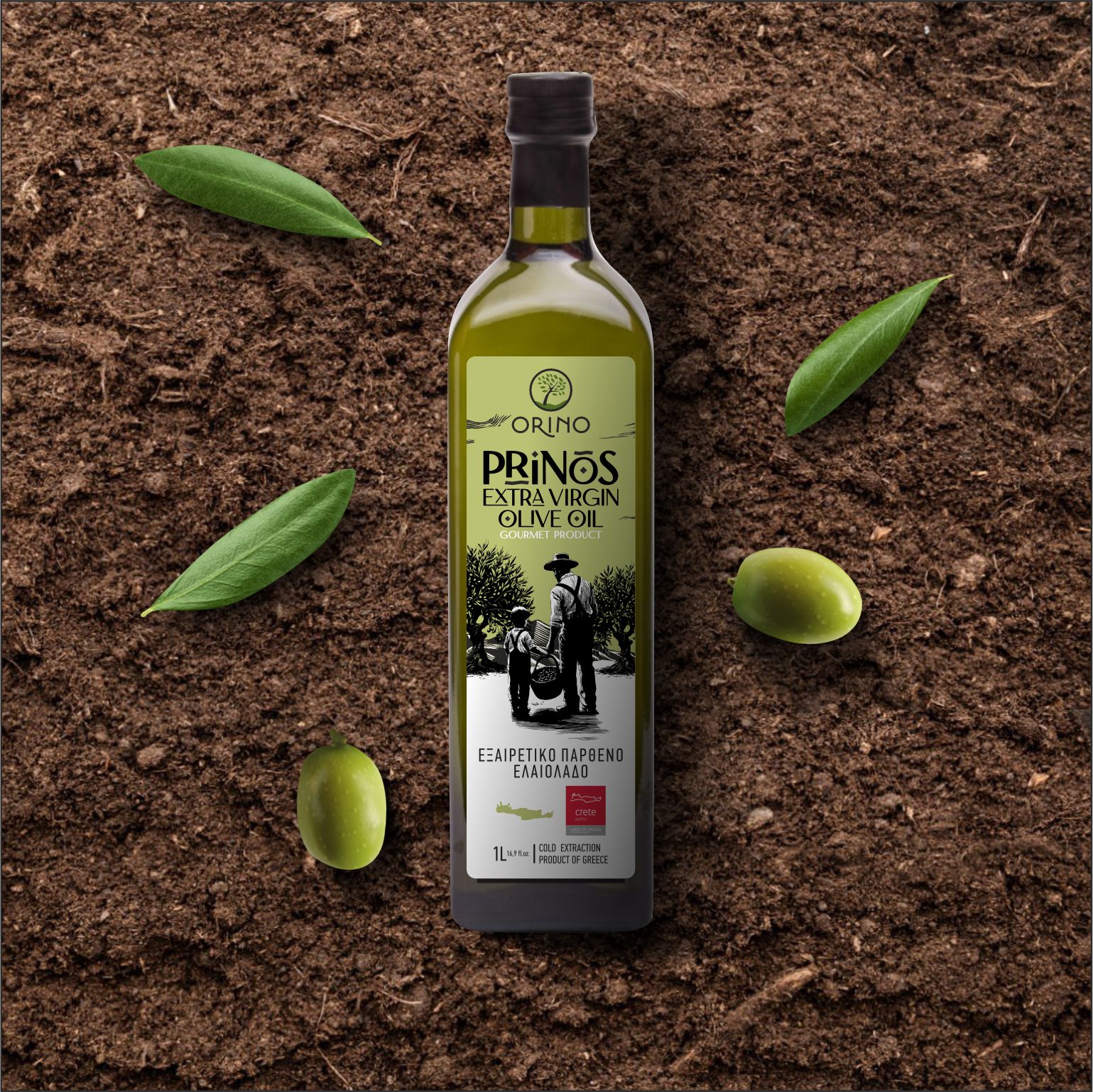
The Orino Prinos project, created for the extra virgin olive oil by the Proistakis Family, is more than just label design — it’s a visual storytelling of place, heritage, and authenticity.
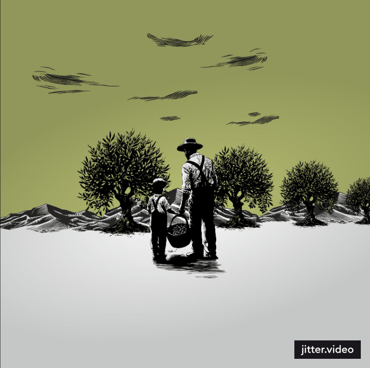
Designed by Leftgraphic, the label captures a tender black-and-white scene of a father and son (or grandfather and grandson) among centuries-old olive trees. This intimate moment reflects generational continuity and deep respect for the land. Earthy green tones contrast with a clean white background, evoking the purity of the product and the wild beauty of the Cretan landscape.
The typography of Orino Prinos, inspired by handcrafted engraving, strikes a balance between clarity and personality. The design remains intentionally minimal, allowing the essence of the story — and the olive oil — to breathe.
At Leftgraphic, we see every label as an opportunity to communicate meaning. Orino Prinos is a powerful example of how thoughtful packaging design can reflect a brand’s roots, honor tradition, and create an emotional connection with the consumer.