Fresh Snack
Rebranding & Packaging Design with a Taste of Snack Culture
Fresh Snack, a dynamic player in the ready-to-eat food and snack market, approached Leftgraphic with a clear goal: to redefine its visual identity with freshness, energy, and modern appeal. The challenge was to design a brand that connects instantly with today’s fast-paced consumer — visually, emotionally, and commercially.
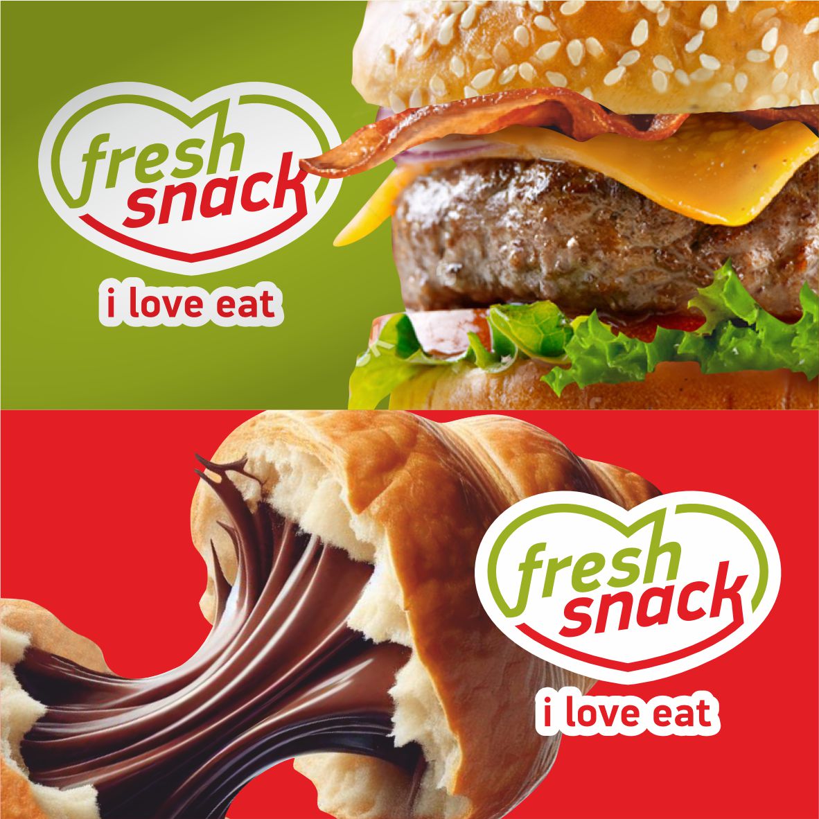
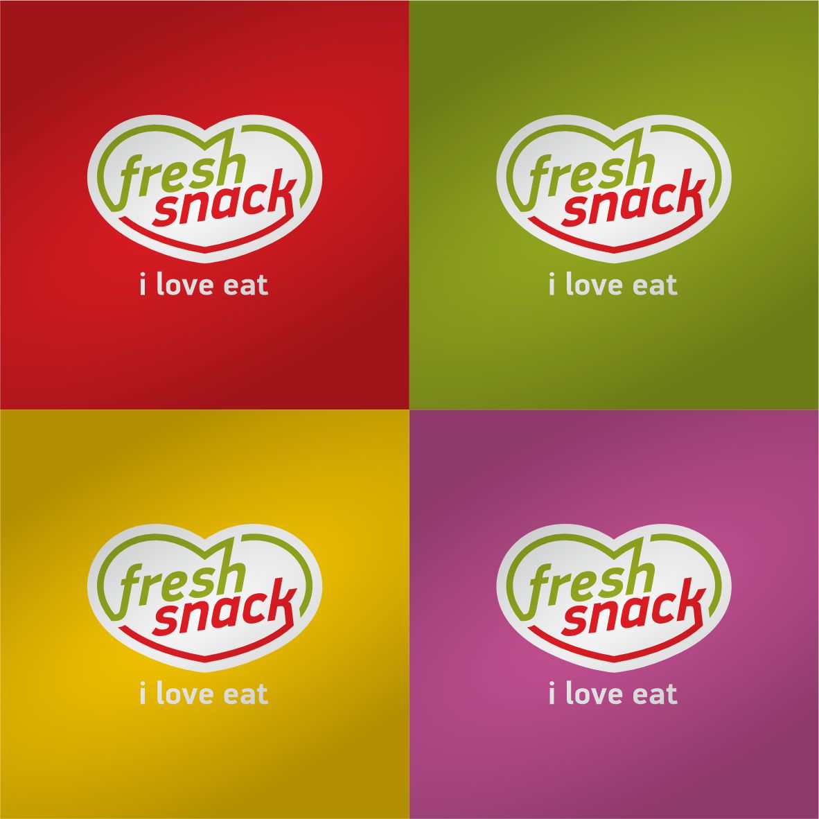
We redesigned the logo, preserving the heart as a central symbol but giving it a renewed sense of balance and simplicity. With clean lines, a friendly geometric typeface, and a vivid color combination of green and red, the new logo captures the essence of freshness and flavor in an immediate and memorable way.
This new identity extends across all product packaging, creating a cohesive yet flexible visual system. Each item is distinguished through its own color palette, allowing the range to feel diverse yet unified. The result is packaging that stands out on the shelf, communicates quickly, and invites the consumer to engage — and enjoy.
Beyond aesthetics, the strategy behind the design was rooted in clarity, usability, and shelf impact. We set out to create a brand that not only looks great but works effectively across all touchpoints — from physical packaging to digital presence.
The outcome is a vibrant, modern, and easily recognizable brand that fully embraces the spirit of Snack Culture, transforming everyday snacking into a branded experience.
At Leftgraphic, we don’t just make things look good. We design with purpose — to connect, to elevate, and to inspire.

